What is a Landing Page
A landing page is a "standalone" webpage, created for a very specific, typically promotional, purpose, such as introducing a new product or promoting a seasonal campaign.
But what do we mean by the term standalone?
Landing pages are designed without the intention of complementing or linking to a company's website; instead, they are created to direct visitors to a specific action, such as purchasing a service or product, subscribing to a mailing list or event, downloading a digital product, etc.
In most instances, landing pages are temporary in nature. Consequently, they are deactivated after a period, with no option for access to them thereafter.
Landing Page vs Homepage

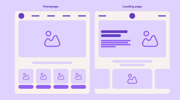
The homepage of a corporate website typically provides a general overview of the business, resulting in a wide range of information and links that direct visitors to respective pages. Upon closer inspection, the homepage has dozens of potential "distractions" that can grab the visitor's attention and lead them to wander through various pages and sections of the website. Which is, in fact, the purpose for its creation.
In comparison, a landing page is designed extremely targeted to provide specific information and encourage visitors to take a desired action. The primary purpose of a landing page is to convert visitors into customers, subscribers, or guide them towards a specific action, such as purchasing a product, subscribing to a newsletter, downloading digital material, and similar actions.
Advantages of Landing Pages
Increased Conversions
When it comes to promotional campaigns, most businesses choose to direct their audience either to the homepage of their business or to a simple contact form with no accompanying information. However, data reveals that 96% of users visiting a website will leave without completing any conversion or purchase.
But why does this happen? This behavior seems to be attributed to a tendency that psychology calls "the paradox of choice" or in simple terms, the more options we have, the harder it is for us to decide.
This is why it's incredibly important to direct visitors to a targeted landing page that can deliver much better results and increased conversions.
Collecting Valuable Data
Most of the time, in exchange for the content a landing page offers, users are required to submit information such as their name, email, and more. Through this process, you have a first-rate opportunity to grow your subscriber list easily and quickly.
Additionally, people who choose to subscribe to your list to receive relevant content or offers have developed an interest in the services or products you offer. This means that these specific subscribers are more likely to make a purchase and convert into regular customers who will bring revenue to your business.
Landing pages can reveal which content resonates more with your audience by assessing the engagement they record on different pages (e.g., offers, educational content, events, etc.), while observing where visitors come from can help you identify the preferred channels of your potential customers.
Overall, with proper analysis and evaluation, you can leverage valuable data collected from landing pages to create a more personalized marketing strategy that will boost conversions for your business.
5 Tips for successful Landing Pages

-
Start with the Benefits
The first and perhaps most important step for a successful landing page is to present your product or service in an appropriate manner. Communicate all the benefits a consumer can enjoy by leveraging what you have to offer. Show them how their life or work will improve by choosing your business.
-
Showcase Customer Reviews/Testimonials
Use comments and reviews from satisfied customers to increase conversions through the landing page. When visitors recognize that other customers and businesses appreciate your product, it creates a sense of trust towards your brand and strengthens the credibility of your business.
-
Use Only One Call to Action (CTA)
Every landing page should be designed to meet only one goal. This goal can be a special offer, a free trial, participation in a contest, registration for a webinar, or obtaining digital material (e.g., an e-book). Unnecessary CTAs or links to other pages distract the visitor from the desired goal, so it's important to maintain only one CTA located prominently on your page.
Extra Tip: If your landing page includes lots of information and images, you can place two CTAs, one at the top and one at the bottom of the page. This way, you ensure that wherever the visitor is on the page, they always have immediate access to a CTA.
-
Keep the Registration Forms Short and Simple
If your registration forms have many fields to fill out, they might be off-putting, resulting in potential customers not completing the desired conversion. An excellent tactic to make your forms more attractive is to add "white space," i.e., reduce the number of unnecessary fields, keeping only the necessary ones. This way, you also improve the loading time of your page.
-
Ensure Flawless Mobile-Friendly Experience
With 59.45% of global internet traffic coming from mobile phones, the design and navigation of landing pages for mobile use are crucial for the success of your campaign. Ensure that the landing pages you design respond perfectly to all types of software and screen sizes, providing a top-notch user experience.
Start designing targeted landing pages today and maximize conversions for your business!

